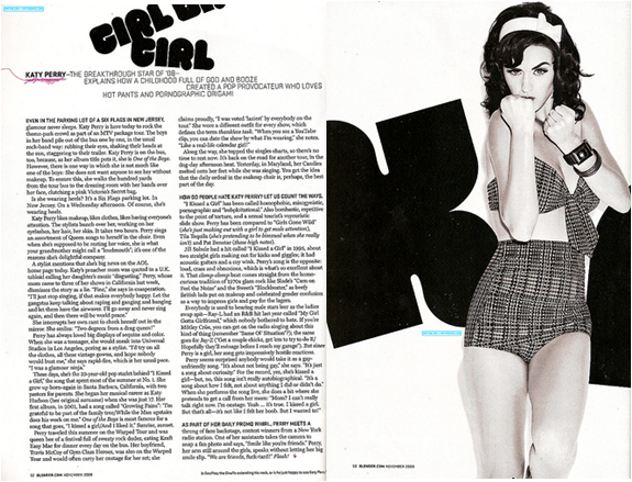
In this double page spread Katy Perry is the main image, mise-en-scene is used as the whole theme of it is black and white making it look original, simple and vintage. Having it in black and white also makes it look professional as so does the columns makes it look professional also.The clothes that she is wearing relates to this as well as they are vintage and appeals to the audience. The lighting in the image is very bright enhancing the star. The main star is very big and takes up half the page showing how important she is.
The main title is bubbly and round which suggests that it may appeal to females more than males as it would be more bold if it was. The darkness of the colour contrasts with the white background making it stand out more. It emphasises it and makes it stand out so you know that it is the main title. Straight away in the sub heading you know who it is about with Katy Perry in bold, using the word 'Hot pants' links with the image as that is what she is wearing.
I would like to do something like this in my magazine as she does relate to the genre i want to do which is pop and is quite girly. I like the colours used as they are professional and make it look better. Its makes the star look more important and the way she is standing looking at the camera shows the direct address that she wants between the audience and her making you feel like you have an insight to her life.
No comments:
Post a Comment